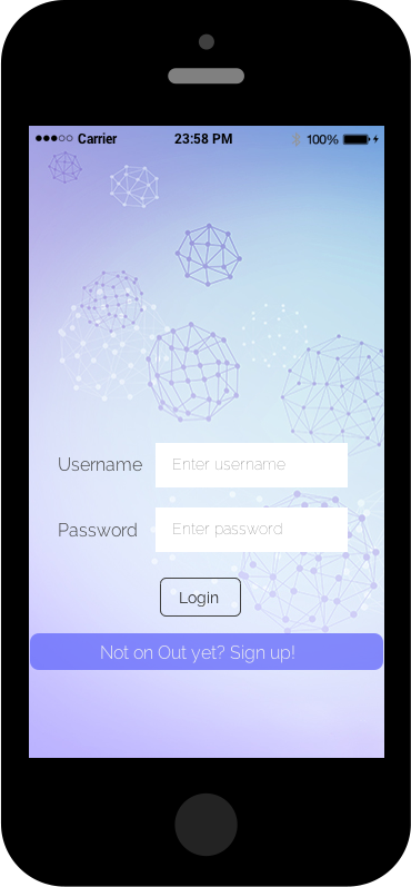
“Out” is a social hangout application being developed by students at my university. Users post about events happening and other users in the vicinity can touch base with them. I designed the color schemes, layout and screen mockups for them. The spheres and links design on the start screen captures the essence of the project – the spheres represent people and links represent the ways in which they meet and interact with one another. We worked around a couple of palettes until everyone immediately fell for the current Lavender, Blue and Grey color scheme!
Social Hangout Application Prototype
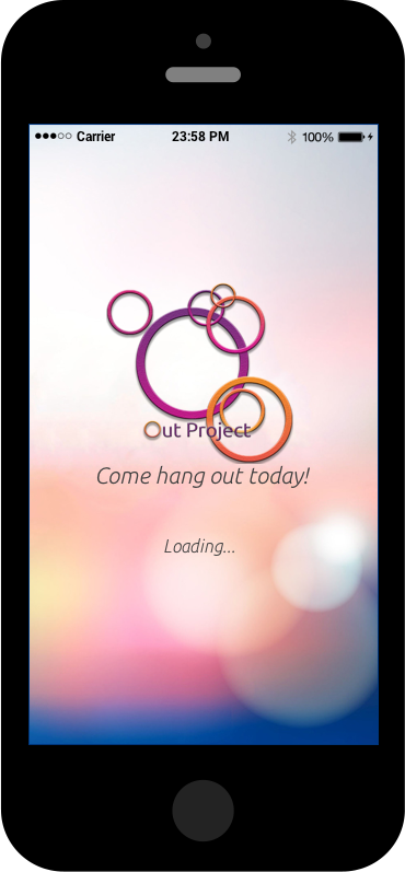
Initial logo and start screen
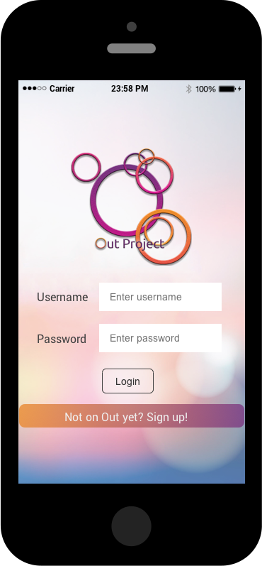
Initial login page
New color scheme, logo and start screen

New login page
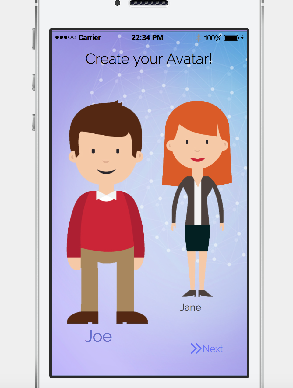
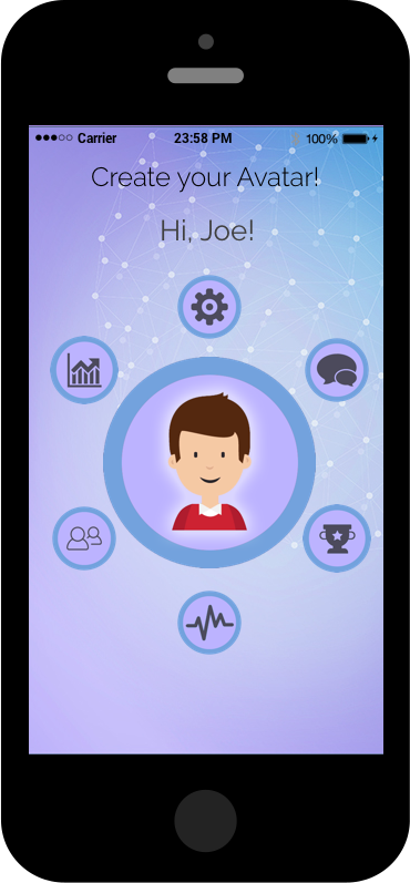
Choosing an avatar
Profile page
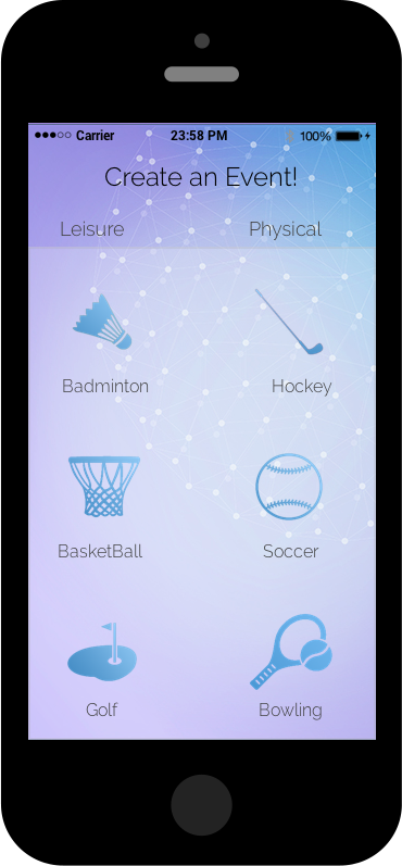
Creating an event
Viewing events around users location

