We spend our time using so many different applications for so many things – social media, transport, fashion, banking, fitness etc.
Over the last few years Waze became a necessary tool for every driver, saving time and frustration of getting stuck in traffic, tipping them about hazards, road conditions, or police traps, and mostly proving the power of social community in contributing to the “common good” of everybody on the road.
I use Waze often, and as a user experience designer, I keep thinking about how I would design the app different. I’ve always felt like flat and minimalist design would be more appealing than Waze’s current chunky feel. I finally got some free time to flesh out some of the ideas I had.
Process:
Putting myself in the perspective of the user, I first created a Waze User Persona and put together a timeline for how the app could be used.


I created the Persona card using Sketch, and the timeline I quickly wireframed in Balsamiq. The timeline ended up being a storyboard of sorts, and helped me jot down a list of scenarios that I would later mock up:
- River can add her home and office address to the Waze app, so that she can quickly access them.
- She uses Waze to help find a route to a particular destination.
- Waze warns her of an accident on route to her destination.
- River uses Waze to report the accident, thus contributing to the social aspect of the app.
Once I had these scenarios, I drew up some paper mockups to create the skeleton of the app. When I did this, I did not particularly look at the existing interface (but had the gist of it in my head from previous usages) and went with my intuition.


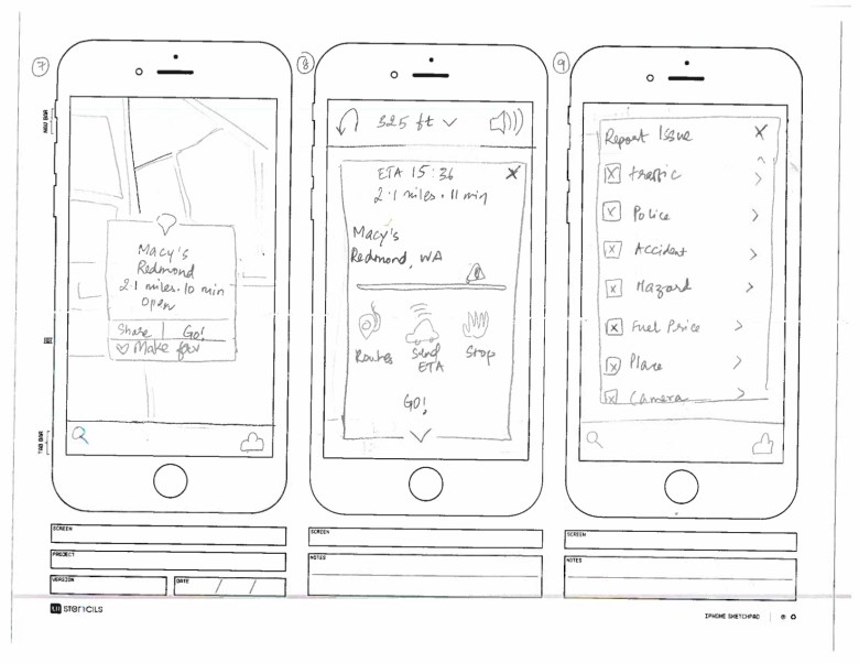
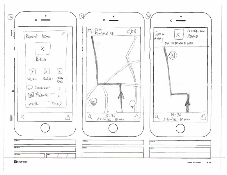
P.S If anyone is looking for paper mockup resources, UIstencils has awesome free and downloadable templates and layouts for various devices, including the one I’ve used above.
Once I had the paper mockups, it was time to create digital mockups. I’ve been wanting to check out Adobe Experience Design since the Beta version came out, and this seemed like a good opportunity to play around with Xd.

Here are the fully detailed screens:


I really liked the functionality Adobe Xd offers; the prototyping capabilities are nifty, and the design features offer tools for quick mocks. IMHO, it’s easier to create icons for mockups in Sketch than in Xd, but Sketch doesn’t offer prototyping powers, so Xd definitely wins in that aspect!
This was a fun pet project, I enjoy redesigning popular applications, giving it a fresh twist of design and usability. Let me know your thoughts in the comments!
