Everyone who knows me knows I’m a huge shopaholic, and I do a lot of online shopping. Combine that with being a designer, and I have an inner monologue going about the layout and user experience as I browse various shopping sites.
One such popular site is Nordstrom Rack, and I personally think it’s time they really re-haul the look and feel of their brand.

I quickly drew up some paper mockups with the basic layout and color schemes. The layout is broken into grids, with the header, menu banner, main grid, social feed and footer.

I then created the web layout with all the individual icons on Sketch, and some of the pictures resized and retouched on Photoshop.

I also translated the main page into a mobile view as well and designed additional click through experiences like the menu bar and shopping cart.

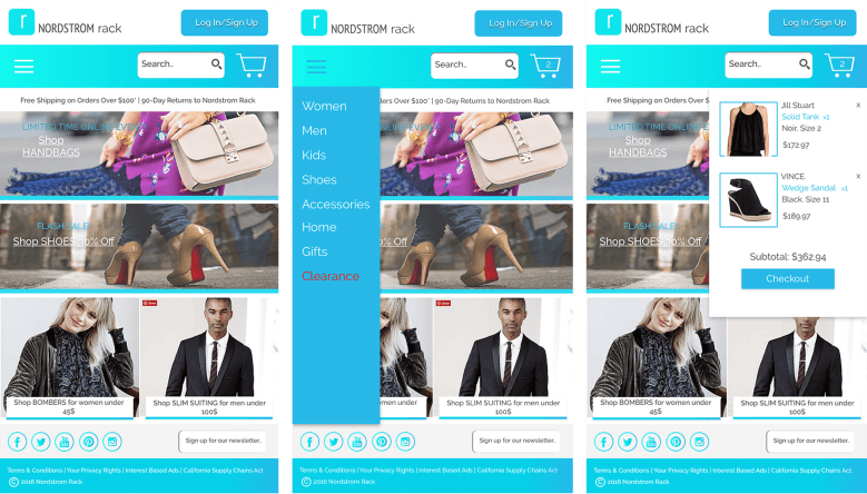
This experiment was more about playing with the visual layout and color schemes to really change up the user experience and get users to be more excited about the whole experience. I did not prototype or add any interactions with these.
