Redesigning popular websites and applications, giving them a fresh twist of design and usability is a hobby of mine. Recently, I decided to redesign Wikipedia, with the idea of making it more fresh, readable and usable across devices.

P.S Please watch the below demo with HD mode enabled, for some reason, I could not get the original resolution to play by default.
After a brief brainstorm on what changes I wanted to make to the widely popular site, I came up with a few themes and features to drive the design process.
Themes:
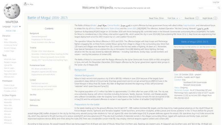
- A minimalist, predominantly black and white theme for the site.
- Less use of lines and borders. Emphasize the layout with use of white space, grids and shadows instead.
- Colors for links and different types of articles.
Features:
- Display the approximate read time of an article.
- Allow users to easily increase/decrease text size.
- A Read Mode that allows the user to consume information undisturbed by hiding all other controls.
- A Night Mode that inverts the color scheme for for comfortable reading in dimmed settings.
Next, I made some wireframes of the layout on Balsamiq.


After, I plugged in my headphones, brewed a strong cup of coffee and sat down with Adobe Xd to prototype these.
Here are the screens:


Let me know your opinions/suggestions in the comments below. Happy designing!
